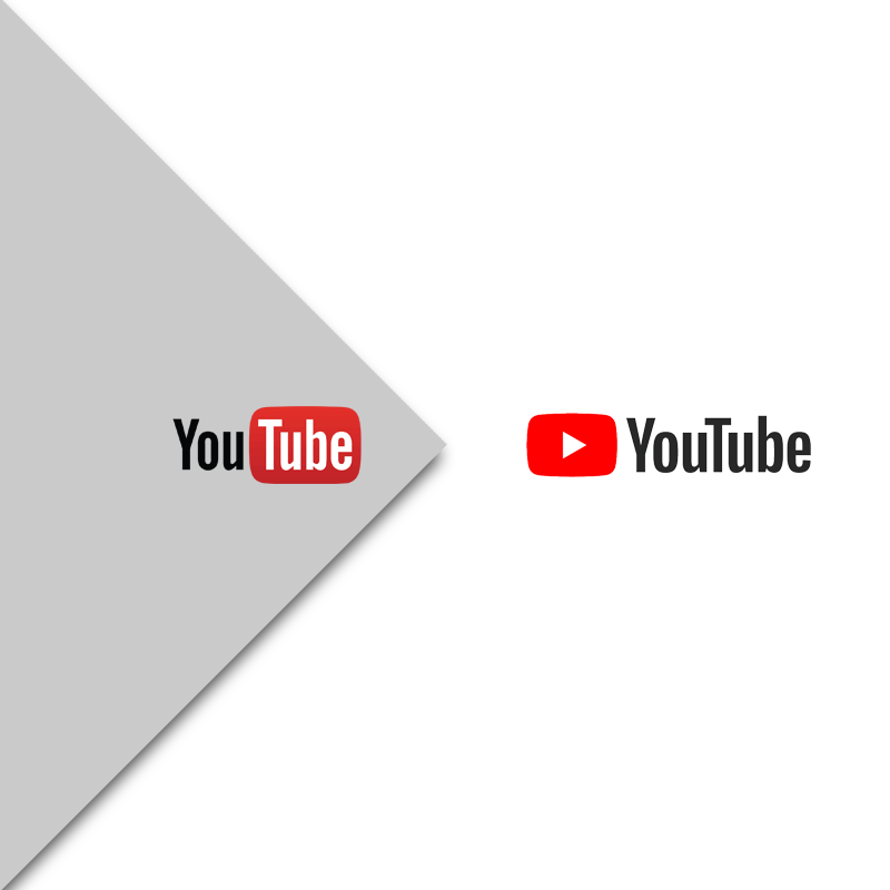
YouTube's logo has been known to sport a red color. In a refresh design update, YouTube updates it, as well as its icon to be more flexible across devices.
The design update is because trends and the internet has changed over the years.
When YouTube was launched in 2005, it was a single website that supported only 320x240 videos at 4:3 aspect ratio. Fast forward, YouTube is allowing users to watch any combination of SD, HD, 4K, 360, 3D, and live video on nearly every device with an internet connection.
All from desktops to phones, tablets to TVs, game consoles, and also VR headsets.
The redesigned logo does away with the classic ‘Tube-in-a-tube’ design. The red blob-like TV that covered the second half of YouTube has been removed. Instead, the red play button that has served the app's icon and visual identifier, is moved to the left of the wordmark.
The new logo is designed to better fit YouTube's multi-screen world by combining a cleaned up version of the YouTube wordmark and Icon.
This creates a more flexible design that works better across a variety of devices, even on the tiniest screens.
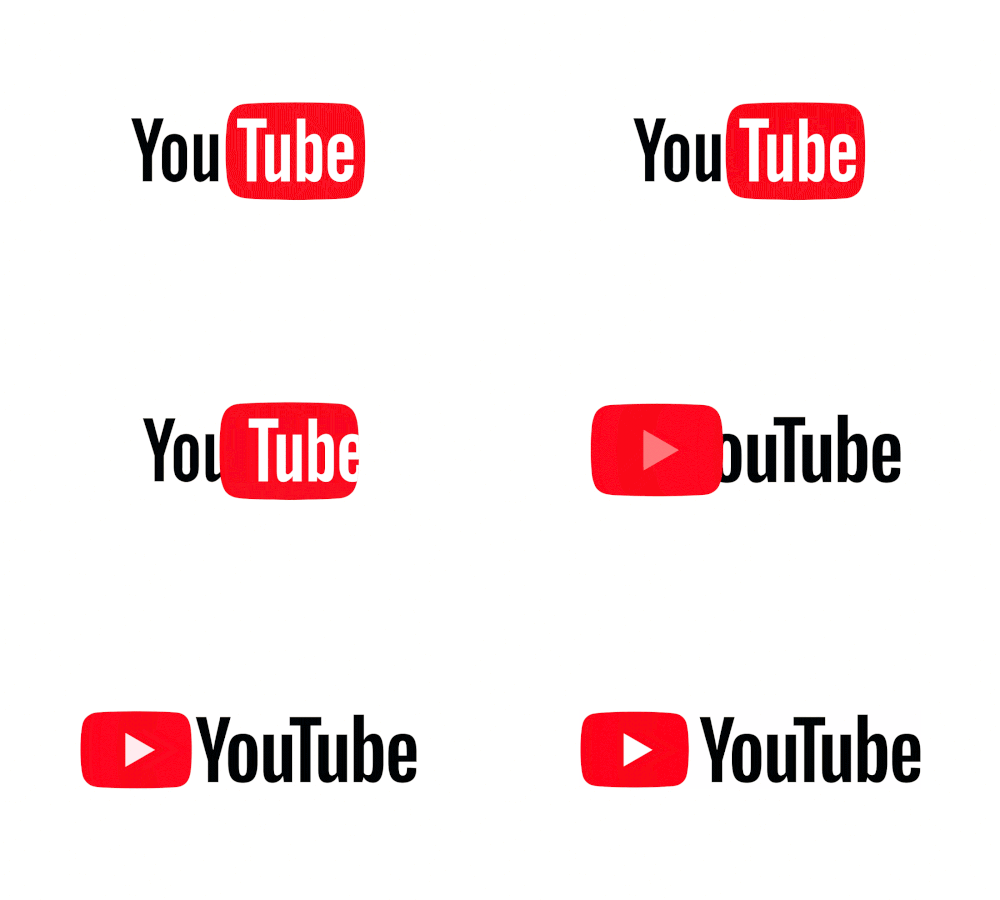
It has been testing new designs for a few months before settling to this one. At that time, YouTube opened itself for suggestions from anyone to try back in May.
The result is a cleaner logo with more Material Design characteristics implemented. There’s also a dark mode for those that prefer not to watch video surrounded by white background color. YouTube also made the red color to be brighter.
"Why’s it more flexible? When room is limited (say on a smartphone) you can use the brightened up Icon as an abbreviated Logo, which will be seen more easily and read more clearly," said YouTube,
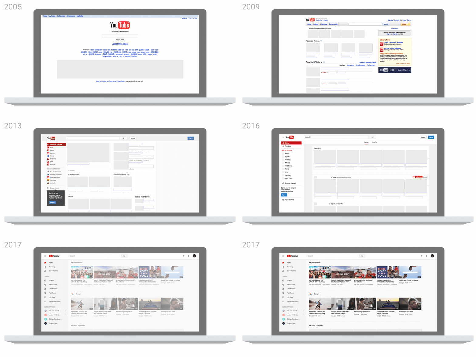
After redesigning its logo for the first time in 12 years, YouTube also introduced apps and services that give users new ways to watch and get closer to contents and creators they like. Each users have their own preferences, and here YouTube is tailoring each profile to be able to see their favorite content, fast and easy.
And to meet the evolving trend, YouTube also adjusts video playback speed on mobile devices. YouTube's app can dynamically change shape to match videos aspect ratio - something that was first shown off in June.
YouTube also made its header white to let content take the lead and moved the navigation tabs to the bottom of the app. YouTube also added Library and Account tabs that give users easy access to what they're looking for.
After gestures to fast forward or rewind a video by double tapping, YouTube said that it's experiment with a feature that lets users to jump between videos with a simple swipe of their hand: swipe left to watch a previous video or swipe right to watch the next one.
YouTube also has added a feature that lets users to view a row of suggested videos while they're watching in full screen.