The photo-sharing app Instagram is one of the world's most influential apps. When it undergoes a design overhaul, whether people are liking it or not, it's there to be seen.
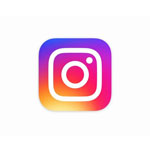
As a start, the beloved polaroid-esque square logo that was once the most recognizable tech logos out there, has been replaced with a background swirl gradient of sunset colors which consist of orange, yellow, pink, purple and blue. The previous retro-looking camera that people are knowing it for is now gone, and is replaced by a white outline of a camera.
The new logo is a refresh with a rainbow-like coloring. At first glance, embracing the flat trend, it looks similar to how Apple's iOS icons are presented.
And not just its main logo, its suite of apps are also having a refresh. Hyperlapse, Boomerang, and Layout apps that are all under Instagram, are having their own new logo, tying all four apps together.
The rainbow-themed icons are supposed to represent Instagram's diverse community, which the company says brings all sorts of life and color to the platform.
"The Instagram community has evolved over the past five years from a place to share filtered photos to so much more - a global community of interests sharing more than 80 million photos and videos every day," read Instagram's blog post. "Our updated look reflects how vibrant and diverse your storytelling has become."

This is the first logo redesign since Instagram first emerged. The design is a move that is trying to differentiate itself from Facebook which acquired it in 2012 for $1 billion.
While the new logos themselves are already a huge change, they are just the start. Inside Instagram, users are seeing more surprises.
As the logos are having a colorful new designs, the user-interface for the apps are the total opposite. There is some changes to the UI with the white top bar homing black icons that replace the usual blue. According to the company, the design layout is more simple. Here, Instagram wants its users to have more focus on the content instead of having its navigations protruding the view.
Changes have also been made to the in-app UI, including an orange to red color choice for notifications and black overall fonts.

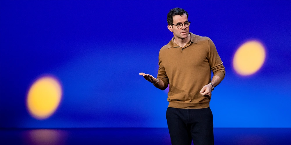
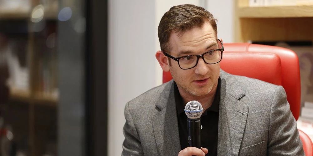
"Color has always been a huge part of Instagram - you see it in the classic app icon, filters, and the community’s photos and videos," said Ian Spalter, Head of Design at Instagram. "When we started reimagining the rainbow, we looked at more minimal options, but ultimately we needed more warmth and energy to complement the glyph."
The new look of Instagram's app, including its logos, are meant for embracing the sleek and modern design lifestyle. Adopting flatter design is making Instagram to blend better with Android's Marshmallow and Apple's iOS 9. Even more, the design is meeting the culture where humans are relying on gadgets more than ever.
In short, the design is the current trend of gadget and internet, and Instagram is trying to follow the trends.
While the introduction of the new logo is meant for a good cause, opinions on social media from Instagram users is split. Some are liking the new logo and others are hating it. Many memes were created to express their feelings.
With users and the media seem focused on its new logo, Instagram's move is in line with its process of changing: It's rolling out the algorithm-based feeds to some users - a change with potentially huge consequences for brands and influencers.