Material Design is Google's way for colorful appetite. Before, the search giant updated its smartphones apps to showcase the company's colorful Material Design interface, and on May 14th, 2015, it's Google Play Music for the web's turn to taste the design.
The redesign is like giving a new fresh coat of paint to Google Play Music interface. Users won't see much of a drastic differences to the prior design beside the sleek tweaks that brought Play Music to a more 'playful' design.
Play Music with Material Design made it looks a lot like its mobile apps, with a bright orange header, cards-like options, collapsible sidebar, and full-width background images for some pages. The search bar has also grown to occupy a larger place at the top of the screen.
The whole point for these is to make a unified experience between mobile apps and desktop. The interface was rewritten in Google's UI toolkit for the web, called Polymer, to bring an app-like experience to web users.
"We're moving towards making the web feel more like an app and less like a series of web pages strung together by links," said Google UX designer Bryan Rea. "The new header, the slick transition as you scroll, the collapsible nav, new animations, these all feel like things you expect in an app not on the web."
Google also updated the fonts and transitions to better emphasis artwork. Just like other services that use Material Design, Play Music is introduced with tons of new little animations. Pages can fade-in when they're loading, and tab indicators can slide over to the new tab, rather than just popping into place like a normal page. The navigation drawer slides into view and the song queue grows out of the bottom right corner.
High-resolution photos occupy the screen behind playlists, albums and artists' bio page.
"For the increased focus on big, immersive artwork, when you're listening to music, you can get lost in it (in a good way)," said Rea. "With the new album and playlist pages, you enter an immersive world focused on the music you're enjoying."
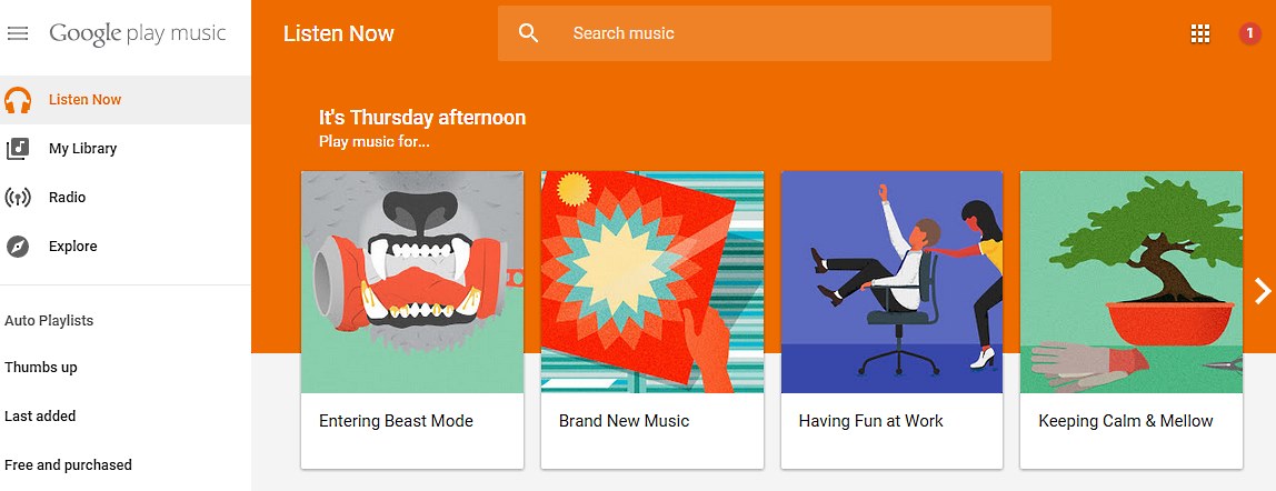
The new implemented Material Design on Play Music also includes small changes. Like for example: the artist's page changes from square photos to circle crops. Similar to designs on Google+ and many other apps when it comes to displaying contacts. According to Rea, "Circles feel more organic than sharp edged squares and rectangles which makes them a perfect fit for people's faces."
One of the useful added feature is the new queue pop-over where users can toggle on by by using an icon at the bottom right. Before Material Design steps in, this disrupted music browsing experience, and took the users back to a dedicated queue page. With the new design, users you have seamless experience for browsing new music, and quickly see which songs are coming up on their list.
Google has also added some accessibility improvements to Play Music by introducing many new keyboard shortcuts and screen reader compatibility.
Play Music with Material Design, is Google's method to keep up with the growing trends when it tries to compete with the likes of Spotify, and others in the paid music subscription service. Google has provided free cloud storage with on-demand subscription service to help it stand out among rivals.
As Material Design is already a trademark of Google's look and feel, with the design coming to more Google's services, Google is unifying the experience of Google across all platform, anywhere, anytime.
Google's Product Forums also got a Material redesign, while Google Translate Community page was updated a few days prior.
Further reading: Google's Material Design as a Principle for Surprising and Enlightening Experience