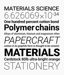
Google updated its main font to work on any screen and on any platform. The Roboto font, introduced in 2012, was overhauled in more than just a series of optimizations.
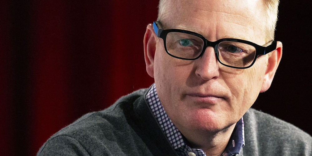
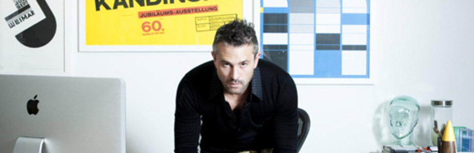
"The old model for releasing metal typefaces doesn't make sense for an operating system that is constantly improving," said Roboto's designer, Christian Robertson.
In other words, as Android evolves, so should Roboto. Every time Android supports a new type of device or changes it's design philosophy, Roboto should be reevaluated and tweaked to make sure that the font still deliver the best single design language.
Roboto, first released by Google in early 2012 as a replacement for Droid font, was designed to be a more modern and approachable typeface that would look great on high-resolution devices. But since Roboto has claimed critics, the new Roboto addresses all the issues while still delivering its character.
Hence the need for an evolving typeface that is just as responsive to criticism as it is to user testing. "That's the way we plan to keep Roboto robust over time," said Robertson. "Most people can't really articulate their reaction to a typeface. The most important thing is to get it in front of people and see how they interact with it."